
Quarrelsome Coffee
Quarrelsome Coffee
Branding a Coffee Roastery
Branding a Coffee Roastery
Be unreasonable. When you do something unexpected, when you do something that makes others question your sanity, that’s when you could be onto something exciting. That was the premise behind the brand design direction for Quarrelsome Coffee. We had our work cut out for us with a name as controversial as "Quarrelsome," so we counter-balanced those emotions with brighter colors and playful illustrations to signal that it wasn't to be taken seriously. The responsive website was built on Shopify.
Services
Brand Identity
Website + Digital Design
Print + Packaging Design
Environmental Design
Artwork + Illustration
Credits
Mark Schwarz + Lance Shaner, Co-founders
Kyle Eertmoed, Brand Design Director
Connor James, Coffee Director
Dexter Stevens, Designer
Lisa Beck, Photographer
Mademan Design, Interior Architect
C&M Interiors, Designer
Kim Knoll, Interior Design Consulting
LP Creative Studio, Videographer
Recognition
2023 Sprudge Design Awards
Overview
Quarrelsome came out of a coffee roaster and a yeast lab, which is not a sentence you write about most cafés. Connor James had spent years teaching himself to roast, chasing flavor by trial and error at Coma before this. Mark Schwarz and Lance Shaner already ran Omega Yeast a floor above, engineering microbes for brewers. Put those two instincts in the same building and you get the actual idea: coffee where the flavor is developed on purpose, during fermentation, using specific yeast and bacteria strains — not blended in later, not roasted in, but coaxed out of the cherry itself. James was flying to farms in Nicaragua and Costa Rica with a dozen yeast strains in a bag to run the first small batches at origin. Our mandate was to build a brand for coffee nobody had tasted before, without making it feel like a laboratory.
Overview
Quarrelsome came out of a coffee roaster and a yeast lab, which is not a sentence you write about most cafés. Connor James had spent years teaching himself to roast, chasing flavor by trial and error at Coma before this. Mark Schwarz and Lance Shaner already ran Omega Yeast a floor above, engineering microbes for brewers. Put those two instincts in the same building and you get the actual idea: coffee where the flavor is developed on purpose, during fermentation, using specific yeast and bacteria strains — not blended in later, not roasted in, but coaxed out of the cherry itself. James was flying to farms in Nicaragua and Costa Rica with a dozen yeast strains in a bag to run the first small batches at origin. Our mandate was to build a brand for coffee nobody had tasted before, without making it feel like a laboratory.


The Space
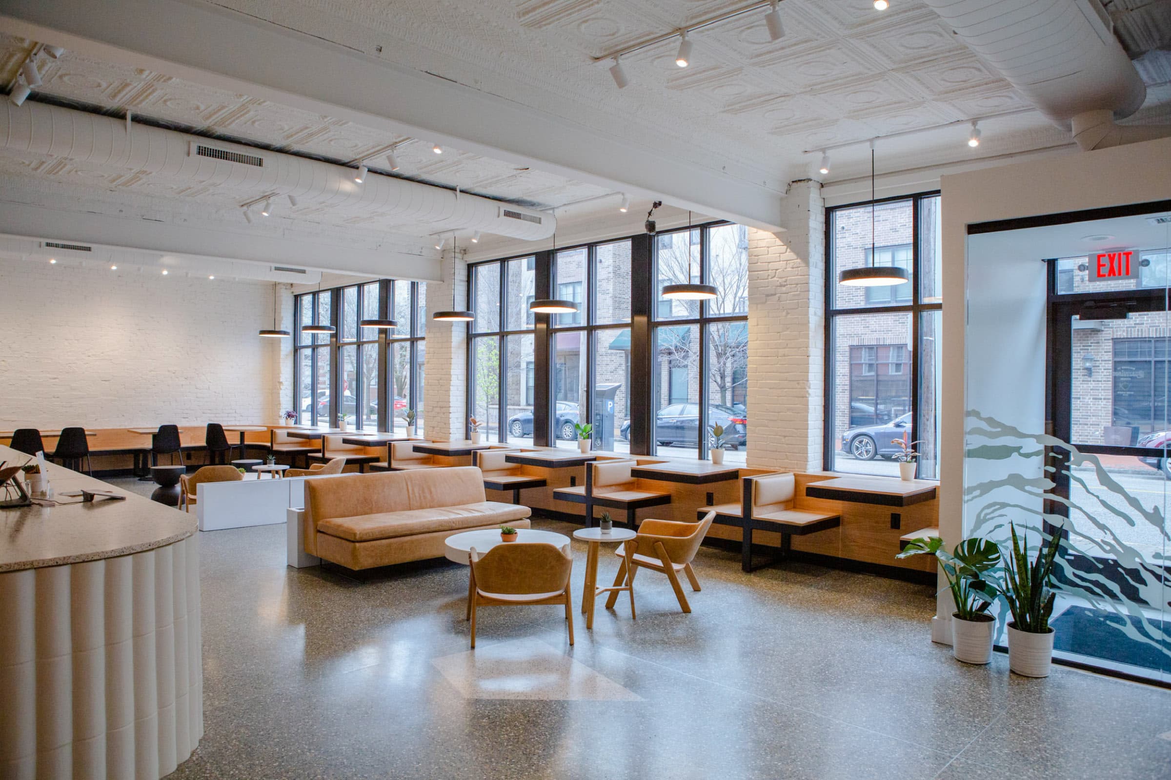
We teamed up with Mademen Design (Architects), where we collaborated on how to bring the brand vision to life through the space. The building was already a century old in St. Louis's Central West End, and rather than gut it, the move was to preserve the "old St. Louis" details and let modern elements argue politely with them. The original terrazzo floor stayed. The vintage pressed-tin ceiling stayed. Against that, handcrafted curved terracotta tiles wrap the front of the café counter and the cupping bar — a warm, rounded, slightly odd detail that reads by hand before it reads by eye. Same brand thesis, built in clay: unexpected, tactile, not too serious.
The Space
We teamed up with Mademen Design (Architects), where we collaborated on how to bring the brand vision to life through the space. The building was already a century old in St. Louis's Central West End, and rather than gut it, the move was to preserve the "old St. Louis" details and let modern elements argue politely with them. The original terrazzo floor stayed. The vintage pressed-tin ceiling stayed. Against that, handcrafted curved terracotta tiles wrap the front of the café counter and the cupping bar — a warm, rounded, slightly odd detail that reads by hand before it reads by eye. Same brand thesis, built in clay: unexpected, tactile, not too serious.


The Brand Vision
The category has a look, and it's tired. Skulls, lightning bolts, blackletter-as-heavy-metal, the whole "coffee is serious business" register. Fermentation coffee had a worse problem. Talk about esters, aldehydes, and metabolites and you've built a chemistry lecture, not a café. So the pivotal decision was to lean into the name and then undercut it. "Quarrelsome" is a provocation; the design's job was to wink at it. We kept one blackletter wordmark for weight and gravity, then surrounded it with a wide, colorful palette, and loose, hand-touched illustrations. A pair of mammoths butting heads. A hand crushing a to-go cup. The science stays real; the delivery stays warm. Nobody feels talked down to.
The tactile proof lived in the packaging and the room. On the bags, we ran a fine speckled pattern down the side gussets. Not decoration for its own sake, but a nod to fermentation bubbling in a sealed tank, the thing that makes the coffee what it is. And when the café itself came together, the same logic held: keep the hundred-year-old bones, add something you'd want to touch. Which is where the space came in.
The Brand Vision
The category has a look, and it's tired. Skulls, lightning bolts, blackletter-as-heavy-metal, the whole "coffee is serious business" register. Fermentation coffee had a worse problem. Talk about esters, aldehydes, and metabolites and you've built a chemistry lecture, not a café. So the pivotal decision was to lean into the name and then undercut it. "Quarrelsome" is a provocation; the design's job was to wink at it. We kept one blackletter wordmark for weight and gravity, then surrounded it with a wide, colorful palette, and loose, hand-touched illustrations. A pair of mammoths butting heads. A hand crushing a to-go cup. The science stays real; the delivery stays warm. Nobody feels talked down to.
The tactile proof lived in the packaging and the room. On the bags, we ran a fine speckled pattern down the side gussets. Not decoration for its own sake, but a nod to fermentation bubbling in a sealed tank, the thing that makes the coffee what it is. And when the café itself came together, the same logic held: keep the hundred-year-old bones, add something you'd want to touch. Which is where the space came in.


The Wordmark
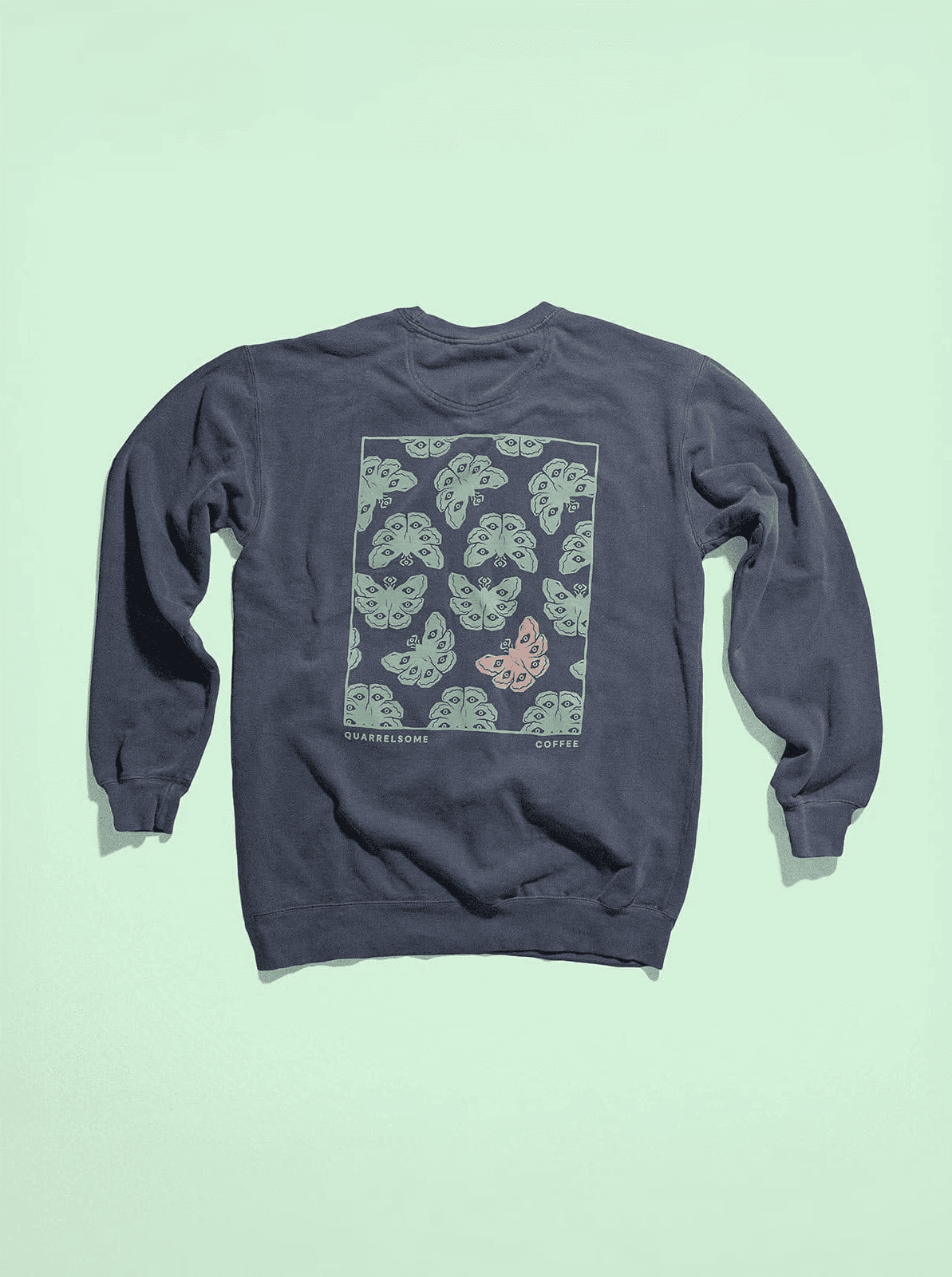
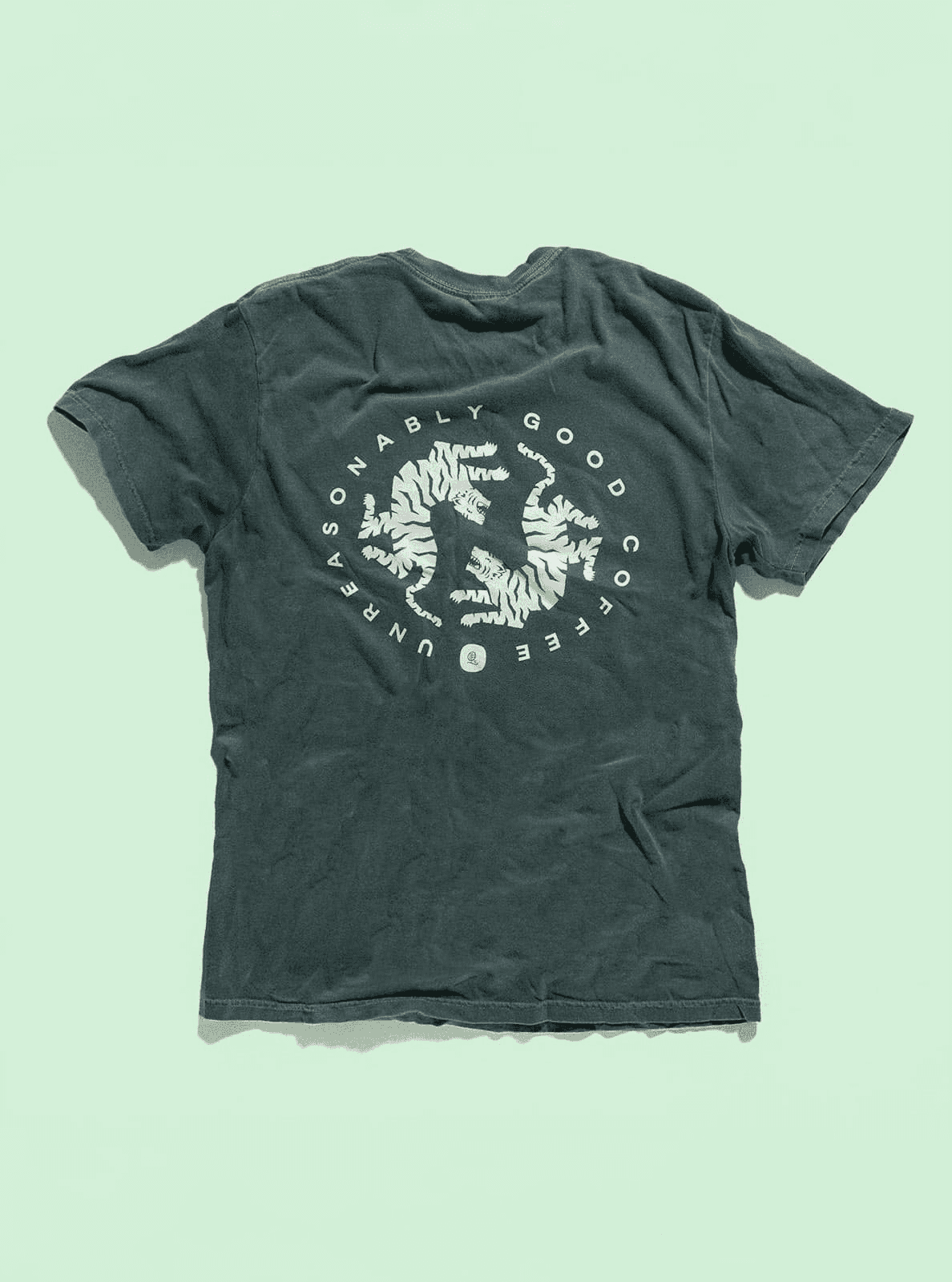
The wordmark is set in a blackletter face — the one genuinely "quarrelsome" gesture in the identity, all Gothic edges and old-world weight. Left on its own it would tip into the exact metal-band cliché we were avoiding, so we paired it with a clean geometric sans and an arched "Unreasonably Good" lockup, then let the color and illustration do the softening. The monogram, a looped Qc, works small enough for an embossed box, a mug base, a hat patch, a coffee cup. One mark, dressed up or stripped down depending on where it lands. The payoff is a logo that looks confident on a burlap sack of green beans and equally at home on a peach business card.
The Wordmark
The wordmark is set in a blackletter face — the one genuinely "quarrelsome" gesture in the identity, all Gothic edges and old-world weight. Left on its own it would tip into the exact metal-band cliché we were avoiding, so we paired it with a clean geometric sans and an arched "Unreasonably Good" lockup, then let the color and illustration do the softening. The monogram, a looped Qc, works small enough for an embossed box, a mug base, a hat patch, a coffee cup. One mark, dressed up or stripped down depending on where it lands. The payoff is a logo that looks confident on a burlap sack of green beans and equally at home on a peach business card.


The Packaging
The retail bags had two jobs: hold the shelf in a lineup of matte-black competitors, and carry a story that's genuinely hard to explain. We went forest green with a warm illustrated crest, a die-cut label detailing producer, region, variety, fermentation, and elevation. Because for this coffee, the fermentation line is the sell. The bags run on post-consumer recycled laminate rather than virgin plastic, which ties straight back to the "Ethical" value the brand was built on. One production run cut reliance on virgin fossil-fuel materials by 80% and kept an estimated 825kg of ocean-bound plastic out of the water.
The Packaging
The retail bags had two jobs: hold the shelf in a lineup of matte-black competitors, and carry a story that's genuinely hard to explain. We went forest green with a warm illustrated crest, a die-cut label detailing producer, region, variety, fermentation, and elevation. Because for this coffee, the fermentation line is the sell. The bags run on post-consumer recycled laminate rather than virgin plastic, which ties straight back to the "Ethical" value the brand was built on. One production run cut reliance on virgin fossil-fuel materials by 80% and kept an estimated 825kg of ocean-bound plastic out of the water.





The Website
The site was built responsive on Shopify so the shop, the subscription, and the story of each coffee lived in one place. Fermented lots don't sell themselves on a scroll of tasting notes. A mixed fermentation with a souring bacteria, or a coffee dry-hopped with non-cherry sugars, needs room to breathe. So the site was structured to give each coffee its own narrative, the way a brewery walks you through a beer. The playful identity did the work of keeping all that science approachable instead of intimidating.
The Website
The site was built responsive on Shopify so the shop, the subscription, and the story of each coffee lived in one place. Fermented lots don't sell themselves on a scroll of tasting notes. A mixed fermentation with a souring bacteria, or a coffee dry-hopped with non-cherry sugars, needs room to breathe. So the site was structured to give each coffee its own narrative, the way a brewery walks you through a beer. The playful identity did the work of keeping all that science approachable instead of intimidating.


More
projects

Omega Yeast Labs
Branding a Brewing Innovation Company

Reductive Calendar
Studio Project
Innovation Park
Branding a Master-planned Development

Optimo Hat Company
Branding a Hat Maker

Pagoda Red
Branding an Antiques Retailer

Totto’s Market
Branding a Neighborhood Market

Kim Scodro Interiors
Collateral for an Interior Designer

Jayson Home
Catalog Design for a Home Retailer
Quarrelsome Coffee
Branding a Coffee Roastery

Top Crop
Branding a Publication

Echo Vie
Branding a Skincare Company

Windy City S&C
Branding a Gym

Hedge House
Branding a Furniture Company

Tru Studio
Branding a Photography Studio

Boss Hair Group
Branding a Hair Salon

Outpost
Branding a General Store