Branding a General Store — Eertmoed Studio — hero shot showcasing the Outpost brand identity

Outpost

Outpost

Branding a General Store

Branding a General Store

Outpost is a modern take on an old fashioned general store. Serving up fresh food, flowers and spirits alongside vintage and antique wares, the shop is situated along the quiet streets of Wayne, Illinois where it’s not uncommon to see a customer riding horseback. Honoring the heritage of the town and the concept of the store, we designed their brand to feel modern with a nod to the past.

Services

Brand Strategy

Logo Design

Visual Identity

Print Design

Signage

Credits

Caroline Scheeler, Founder

Kyle Eertmoed, Designer

Kim Knoll, Designer

Recognition

Published In “Start Me Up!” By Gestalten Publishing

Featured on Design Work Life

Featured on FPO (For Print Only)

Featured on The Dieline

Published In “Monogram Logo” - Counter-Print

Brand Vision

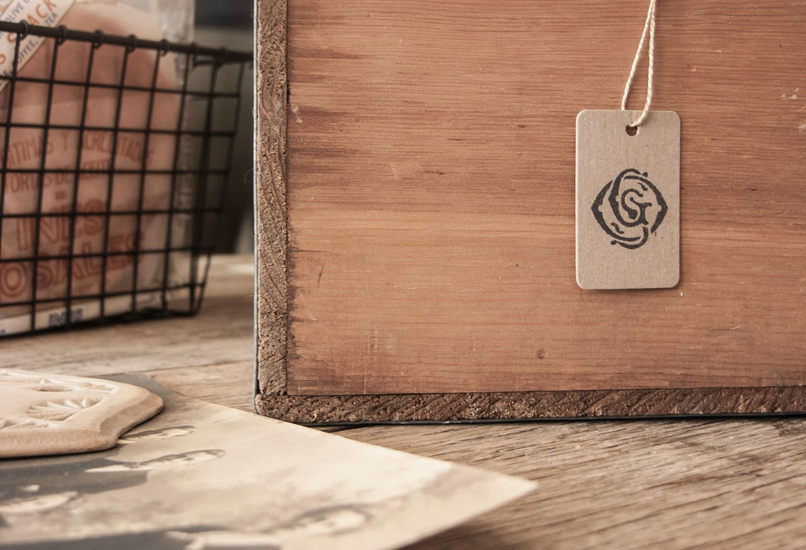
The town of Wayne feels a little bit like Mayberry, where people wave and know your name, or introduce themselves if they don’t. Because the store is situated in one of the historic buildings and the vibe of the area is quaint with just as many horses as people, we wanted their branding to have a familiar feeling, one that feels new with qualities of old. Vintage papers and old victorian lettering inspired the design of their logo and monogram, and the idea of using several typefaces in their identity. We turned both into stamps for things like price tags and grocery bags and used ivory and manila papers to give an authentic look.

Brand Vision

The town of Wayne feels a little bit like Mayberry, where people wave and know your name, or introduce themselves if they don’t. Because the store is situated in one of the historic buildings and the vibe of the area is quaint with just as many horses as people, we wanted their branding to have a familiar feeling, one that feels new with qualities of old. Vintage papers and old victorian lettering inspired the design of their logo and monogram, and the idea of using several typefaces in their identity. We turned both into stamps for things like price tags and grocery bags and used ivory and manila papers to give an authentic look.

More

projects